How does the abstract art of Kandinsky and Klee imitate the meaning and emotion in the music of Shostakovich and Bach?
Aubrey Williams, an artist known for his interest in the composer Dmitri Shostakovich, painted a series of 30 abstract paintings of his symphonies and string quartets. Writing on the series in 1982, the art critic Guy Brett noted:
[Williams] has found a way, in no sense literal, of evoking struggle, conflict, lyricism, peace, of evoking both historical and personal events that you find in the music. Just as Shostakovich believed that ‘every musical composition contains meaning and emotions’, Williams feels the same about so-called abstract forms.
Take, for instance, Williams’s painting Shostakovich 3rd Symphony Opus 20 (above). For those who are familiar with the musical piece, it is not difficult to notice the affinity between the music and the painting. Just as the music can be described as ecstatic, bombastic and unsettling, so too can the painting that is supposed to capture it.
Such associations between music and abstract painting are not rare. It is no underestimation to say that music itself, together with historical factors such as the weakening of Church control over the direction of art and the invention of photography, played an important role in the rise of non-decorative abstract painting, which appeared relatively late in the long history of Western art. In the search for new artistic directions, many artists in the 19th and 20th centuries drew an analogy between painting and music. They used music as a guide for developing their own artform.
Paintings that imitate music exist on a spectrum. On one end, there are abstract artists such as Williams and Paul Klee, for whom music itself sometimes becomes the subject matter. On the other end, there are the likes of James Whistler, Paul Gauguin and Wassily Kandinsky, who paint in a ‘musical manner’, moving away from a concern with representing reality. Whistler, known for his almost abstract ‘nocturne’ pictures, defined painting as ‘the exact correlative of music, as vague, as purely emotional, as released from all functions of representation’. Though not going as far towards pure abstraction, Gauguin saw colours and lines as having the power to evoke emotions and thoughts just like music. When asked why he painted red dogs and pink skies, Gauguin replied: ‘It’s music, if you like!’
The two intertwined ribbons – red and blue – resemble the two interwoven voices in a fugue
The deliberate attempt to emulate music culminated in the works of abstract artists like Kandinsky, where colours and shapes, devoid of representational contents, are art in their own right. But just how can an abstract painting imitate music? How can the two be associated in a deep and meaningful way?
Music is often defined by its structure, and the structural features of Western music had a powerful influence on the development of purely abstract painting. The musical fugue – a form of counterpoint, involving different voices that are melodically independent and harmonically dependent – serves as a prime example of this. In the 1910s, the word ‘fugue’ comes to feature in the titles of many paintings: eg, Kandinsky’s Fugue (Controlled Improvisation), Marsden Hartley’s Musical Theme No 2 (Bach Preludes et Fugues), Adolf Hölzel’s Fugue on a Resurrection Theme, and Josef Albers’s Fugue.
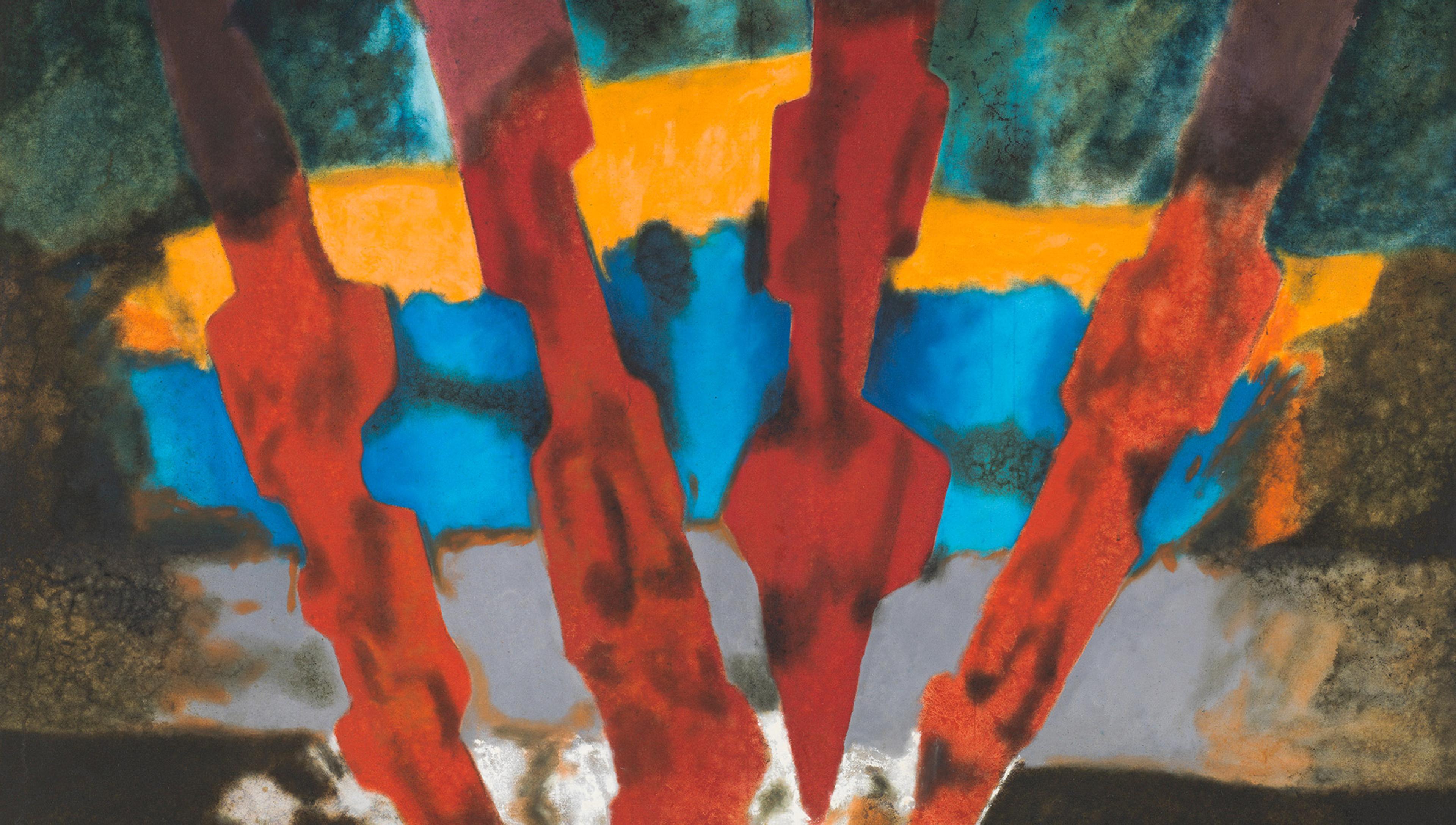
One notable example is František Kupka’s Amorpha, Fugue in Two Colours. In The Music of Painting (2011), the art historian Peter Vergo notes that a pianist regularly played Bach’s fugues during his visits to the Kupkas, which may have ‘led Kupka to reflect on how one might set about translating a fugue in music into the language of painting’. The painting imitates the basic structure of a two-part fugue. The two intertwined ribbons – red and blue – resemble the two interwoven voices in a fugue.
,_210_x_200_cm,_Narodni_Galerie,_Prague.jpg?width=3840&quality=75&format=auto)
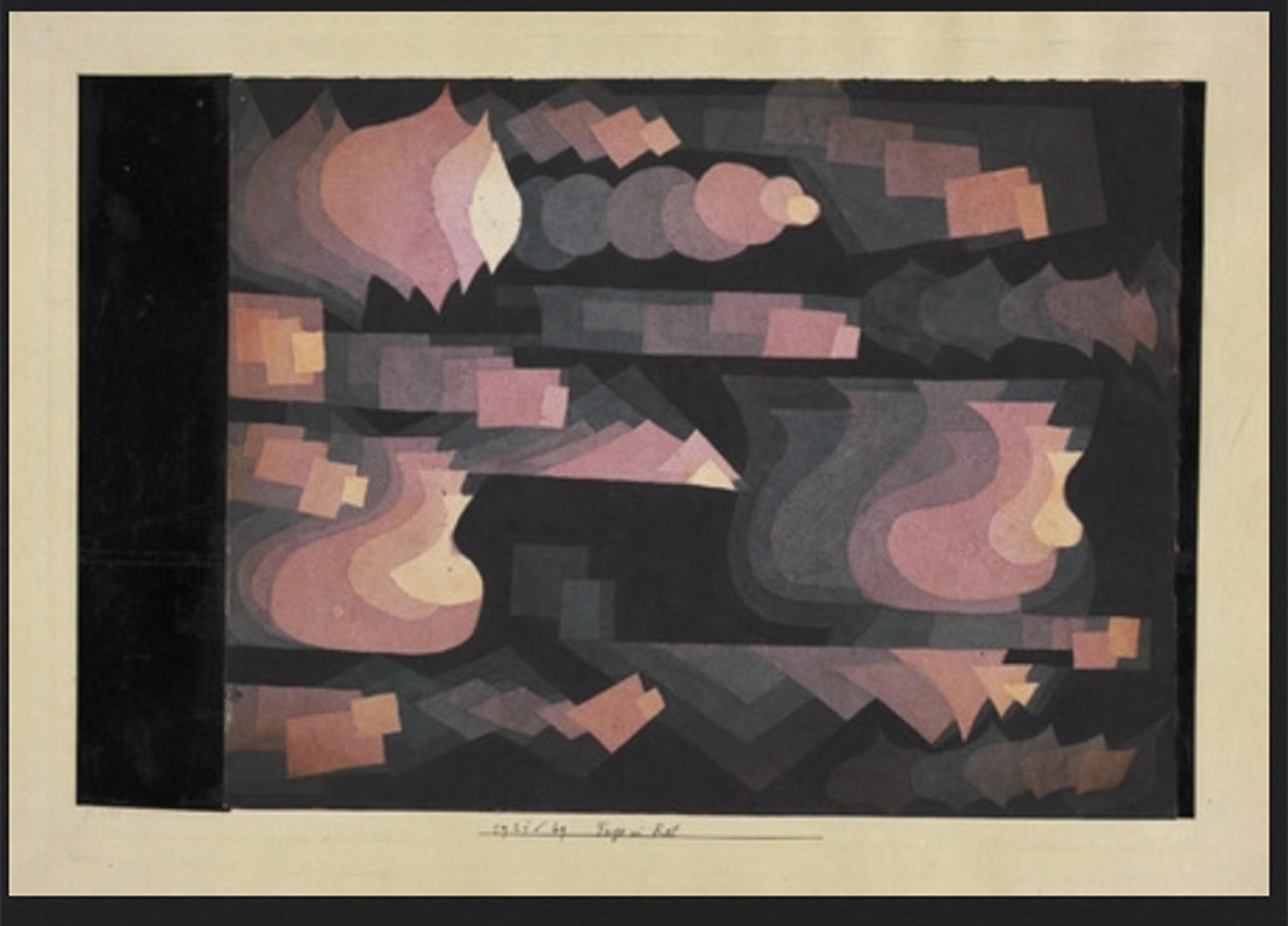
Klee’s Fugue in Red captures a much more complex fugal structure. Various shape sequences – one after another – represent different musical motifs. They reappear in different parts of the painting, just as the musical subjects in a fugue are usually repeated and developed. The left-to-right orientation of the shapes signifies the temporal order of the music. The inverted triangles on the bottom right resemble the technique of melodic inversion, sometimes used in fugues, where the intervals making up the subject are turned upside down. Klee was himself an accomplished violinist, with a special interest in the music of Bach and Mozart. So, it is not surprising that his visual ‘fugue’ is much more elaborate in its musical associations than Kupka’s. Just as the structural complexity and the interconnectedness of different musical motifs are often the focus of a composer, colour arrangements and the way different shapes visually relate to one another can be the sole concern of an abstract painter.
‘In music, a light blue is like a flute, a darker blue a cello; a still darker a thunderous double bass; and the darkest blue of all – an organ’
Structural features are by no means the only aspect to which abstract artists can attend when they emulate music. Some have speculated about natural associations between colour and musical sounds. In his book Concerning the Spiritual in Art (1912), Kandinsky posited various associations between, for instance, shades of blue and instrumental timbres: ‘In music, a light blue is like a flute, a darker blue a cello; a still darker a thunderous double bass; and the darkest blue of all – an organ.’ Colour-music correspondences were also noted by composers. Alexander Scriabin’s Prometheus, for instance, is scored not only for conventional instruments but also for a ‘colour organ’ that is supposed to project colours – corresponding to different keys – into the concert hall while the orchestra is playing.
Many artists also think colours and lines are associated with different emotions and feelings, just as we normally think about musical sounds. This is again best exemplified with reference to Kandinsky, whose works often showcase his fixation on colour symbolism. Consider his Impression III (Concert). The painting is semi-abstract, depicting a recital of Arnold Schönberg’s piano music that Kandinsky attended in Munich in 1911. The salient black shape in the middle represents a grand piano. The blue stripes next to it may be supposed to carry deep significance. Blue, for Kandinsky, is ‘the typical heavenly colour’ where the ‘power of profound meaning is found’. The choice of colour, apparently emanating from the piano and providing the eye with sanctuary from the blazing reds and yellows that dominate the scene, suggests the profundity of Schönberg’s music. Various colours and black lines are used to represent members of the audience. The critics are represented on the top left, surrounded by red and orange patches, suggesting the emotions of anger and outrage. A striking yellow, bright yet somewhat murky, fills the painting’s right side. Again, the colour is no coincidence. For Kandinsky, yellow ‘has a disturbing influence’ and ‘an insistent, aggressive character’ that parallels with a ‘violent raving lunacy’. The colours wonderfully evoke the painting’s subject matter – the provocative vitality for which Schönberg’s music is known.
_-_Google_Art_Project.jpg?width=3840&quality=75&format=auto)
The specific associations posited by artists like Kandinsky may be expressions of their own idiosyncrasies and subjectivity. Nevertheless, that there are non-arbitrary colour-music associations, and that certain colours and musical samples have similar emotional associations, is well known to psychologists. In a 2020 study, Liliana Albertazzi and colleagues tested whether there are associations between a series of Kandinsky’s paintings and a series of excerpts from Schönberg’s piano works. Fifteen paintings by Kandinsky, ranging from figurative to abstract, and 14 musical excerpts from Schönberg, ranging from passages of tonal harmony to ones exhibiting serialism (otherwise known as the 12-tone technique), were presented to participants who had no specialist knowledge in music or art. Results showed that, despite the complexity of the stimuli, there was broad agreement among the participants’ judgments, suggesting that there are systematic associations between the paintings and the musical selections.
Judgments regarding music-colour associations are mediated by common associations of emotions
In an influential 2013 study by Stephen Palmer and colleagues, participants were presented with musical samples from Bach, Mozart and Brahms while viewing different colour patches. They were asked to select best-matching and worst-matching colours in relation to the music. Results showed a high degree of convergence in participants’ judgments. In particular, more saturated, lighter, yellower colours were judged to be associated with faster music in the major mode, whereas greyer, darker, bluer colours were found to be associated with slower music in the minor mode.
In the same study, participants were also given eight emotional descriptors – happy, sad, angry, calm, strong, weak, lively and dreary – and were asked to rate how strongly each musical sample and each colour patch was associated with each descriptor. Colours and music samples that were judged to match also turned out to share similar emotional associations. Palmer and colleagues take the results to show that judgments regarding music-colour associations are mediated by common associations of emotions. But this still leaves us with the question of why it is that certain colours, and certain musical samples, are associated with certain emotions in the first place.
In his book Self-Expression (2007), the philosopher Mitchell Green has an interesting suggestion. He thinks that every experience, whether sensory or emotional, can be located in a multidimensional space. He proposes three dimensions: intensity, pleasantness and dynamism. For Green, the reason that a certain colour is associated with a certain emotion or a musical sample is because the relevant experiences have similar coordinates when located along these dimensions. Yellow is a better match for happiness than blue or green, because we experience it as more intense and dynamic than the other two colours, and happiness is dynamic and often intense. On this view, when we make judgments about correspondences between stimuli from different domains, we are in fact implicitly measuring the relevant experiences in this multidimensional system.
Whether or not Green’s theory is right is up for debate. For instance, one might not fix on the specific dimensions he suggests. One might also think that cultural conventions likely play a role. The colour red may signify anger and passion in Western cultures, as illustrated by Kandinsky’s Impression III (Concert), but this is also the colour of joy and auspiciousness in Chinese cultures. Similarly, one might suspect colour-music associations to vary somewhat across cultural contexts.
Nevertheless, there are correspondences between colour and music, as well as between colour and emotion, and between music and emotion. So it is no surprise that early abstract painters attended to them in their creative process, thinking about how colours can be liberated from their constraints of representing reality and treated aesthetically in their own right, just like the sounds that make up music.
But this leaves us with a conundrum: if the structural features and emotional associations of music can be carried over into painting, then why is it that so many people are so easily moved by music, when abstract paintings leave them cold? The forerunners of abstract art were eager to make the point that colours and lines can be just as powerful as music. But reality suggests the contrary: most of us seem to be more receptive to music than to abstract art. This may also be why abstract painting appeared so late in the history of Western art. However, just as the deep appreciation of a piece of music requires patience and understanding, perhaps the same also goes for the appreciation of an abstract painting. With curiosity, sensitivity can be developed, such that the sight of interesting colour arrangements may be enjoyable and rewarding to the attentive eye.