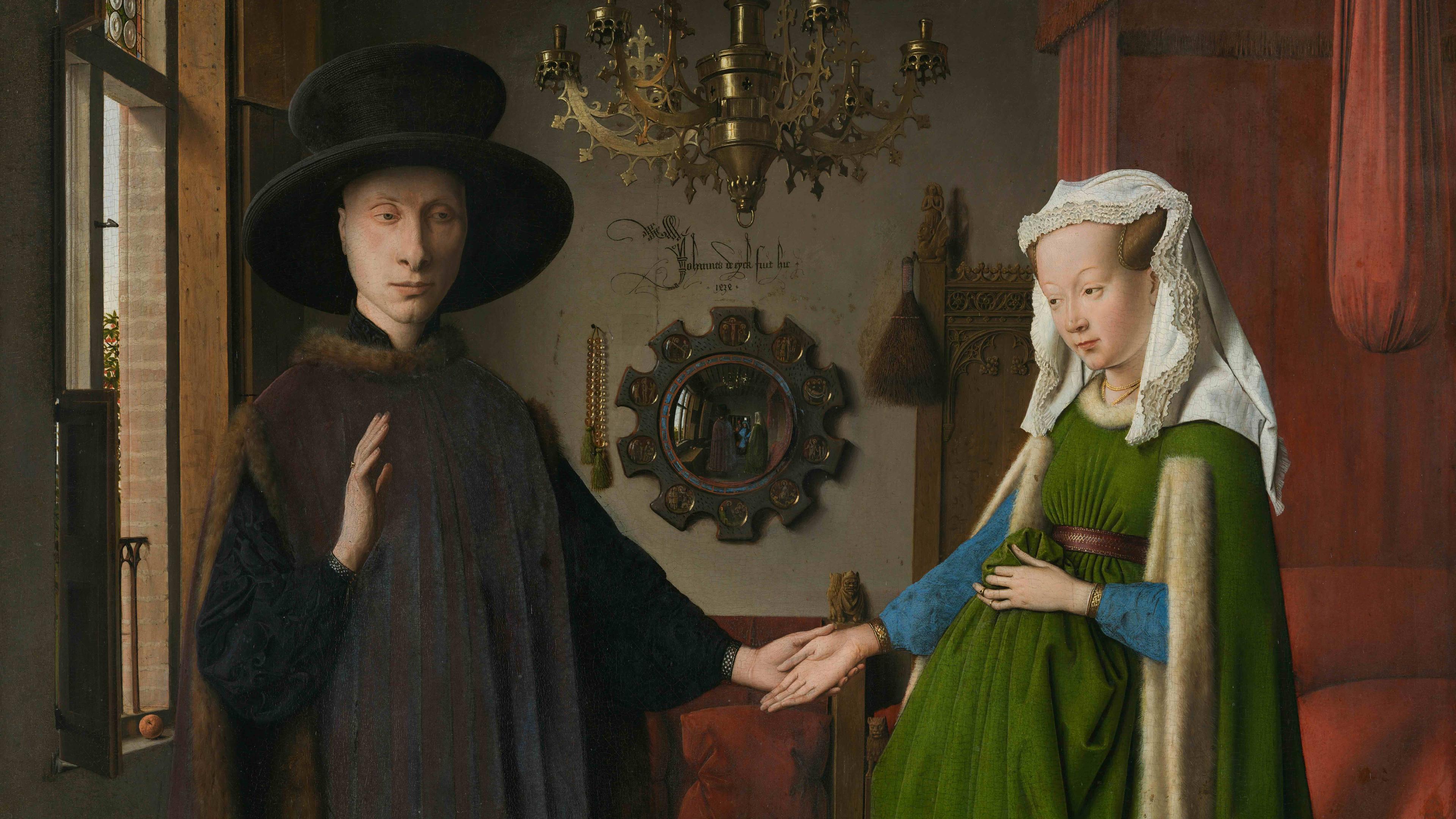
When I teach introductory art history, I often start by showing students Jan van Eyck’s Arnolfini Portrait (1434) and ask them what they see. There’s a lot to look at in the painting: lavish textiles, an ornate chandelier, the crisp gleam of a leather belt; a hat, a mirror. After some initial hesitation, my students – mostly teenagers – will start to toss out details. They note that the painting’s subjects are holding hands, that the man looks stern, that the people are pale, that he controls her. Some of this is true, some is conjecture. Regardless, there is much they do not see.
.jpg?width=3840&quality=75&format=auto)
Arnolfini Portrait (1434) by Jan van Eyck. Courtesy the National Gallery, London
Not once has anyone mentioned the dog at the couple’s feet, or the large red bed in the background; no one refers to the pair of wooden shoes tossed in the corner, or the cascading green dress worn by Arnolfini’s very pregnant wife. They do not register the ornate chandelier so do not consider this couple’s wealth, which is all I see when I spot the dangling tassels, gold bangles and crop of oranges. What my students fail to see can be chalked up to several things. They want to impress me by looking for gender dynamics and hidden symbols; they may want to discover something hitherto unnoticed – a big task given that the Arnolfini Portrait is more than 500 years old, and they’ve studied art history for only 30 minutes. Perhaps they think I’ve posed a trick question, with a right and logical answer. Whatever the reason, they repeatedly fail to see the same things and, after several versions of this exercise, I have stopped being surprised by what they miss because, despite living in a visual world, visual literacy is a skillset rarely taught. It begins with learning how to look.
In art history, looking is a process. Art historians look to understand what we’re dealing with – is the painting big, claustrophobic, abstract, joyful? – but also to understand how it fits with all the paintings that came before. In the case of the Arnolfini Portrait, van Eyck has painted a double portrait, so perhaps we should consider the almost contemporaneous Portrait of a Woman with a Man at a Casement (c1440) by Fra Filippo Lippi. Or that, in the 15th century, oil painting was just gaining traction. Or we can think about the green dress and how the woman is depicted: does this conform to or challenge other works showing female sitters?
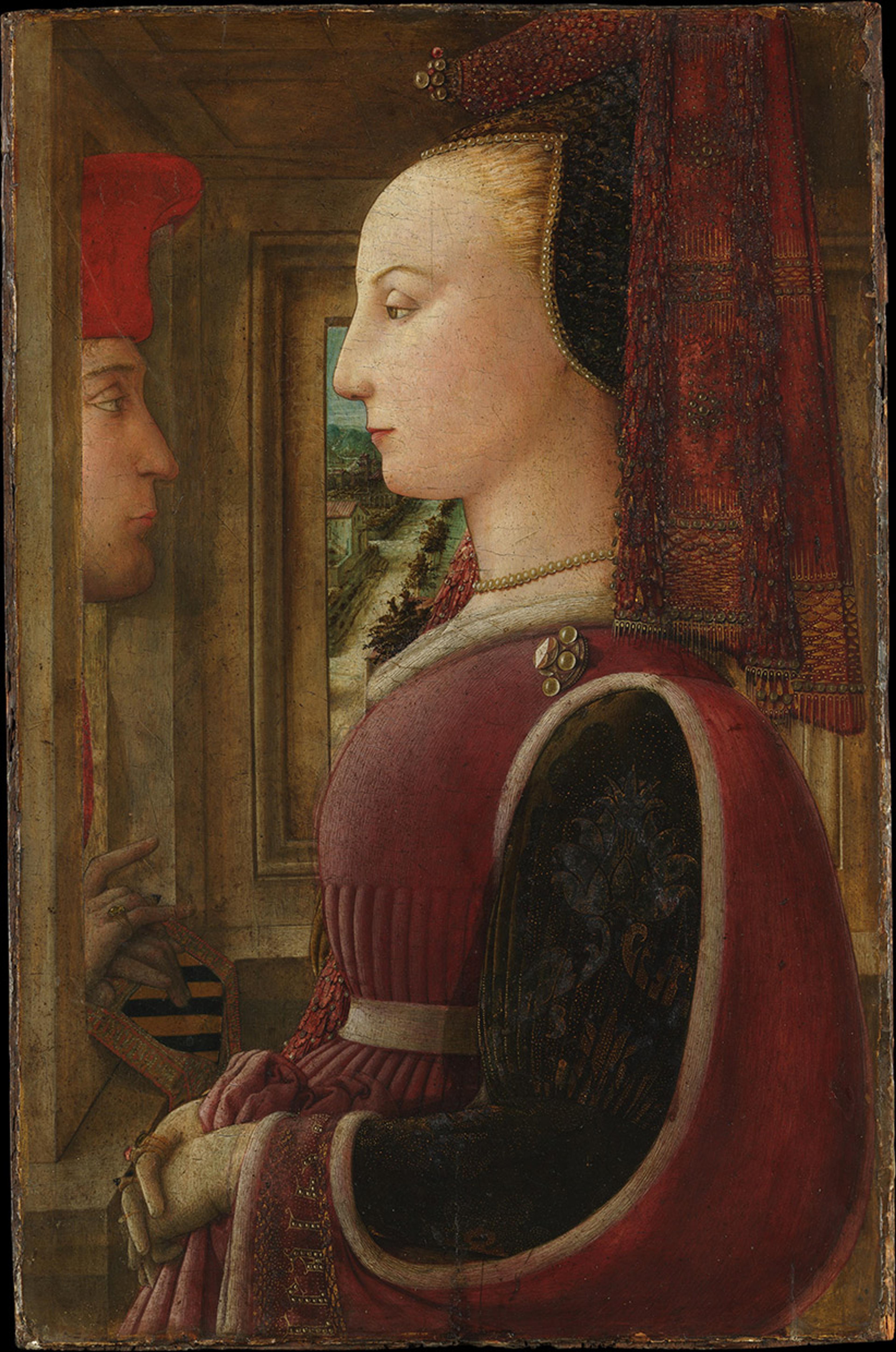
Portrait of a Woman with a Man at a Casement (c1440) by Fra Filippo Lippi. Courtesy the Met Museum, New York
All the elements of the painting contribute to its meaning; so to miss the dog, or the slippers, or the red bed, is to miss out. ‘We never look at just one thing,’ wrote John Berger in Ways of Seeing (1973). ‘We are always looking at the relation between things and ourselves.’ If how we see is determined by what we know, believe and have been taught, then not seeing is also a reflection of these conditions.
Ours is an image-saturated world, which makes sense, given how sight arrives before speech. Yet visual literacy is often an afterthought, perhaps because it is associated with the specialised looking of art history. But we look at things all the time: at stamps, Ikea instructions, book jackets, press photographs, billboards, comics, Google doodles – the stuff that James Elkins in The Domain of Images (1999) refers to as ‘informational images’ – images that confront us all day, every day, in a barrage, or ‘flow’ or ‘stream’. The amount of visual information we routinely process is unfathomable. But presenting visual media this way prioritises speed-processing at the expense of lingering. It also, notes the writer and visual artist Michelle Henning, ‘intimates potential disaster’ – invoking a ‘flood’ that overwhelms the viewer even when some of this material very much warrants our attention.
It is difficult to observe incorrectly. There is a dog in the Arnolfini Portrait. The couple is standing in a room. Art, images, may intimidate the uninitiated, but we need to explode the idea that is impossible to do well without having the right training. Art history is ekphrasis, but such exercises can be taught outside of the discipline. Here is Rembrandt’s The Night Watch (1642). What do you see? Who is in the foreground? Do you see the plumed hats, red velvet, the face blocked by an arm? I’m intrigued by the sheen of the silver sash echoed in the little girl’s dress. Why make those two figures glow? Do the militia men look proud? Nervous? Angry? Look, then look again.
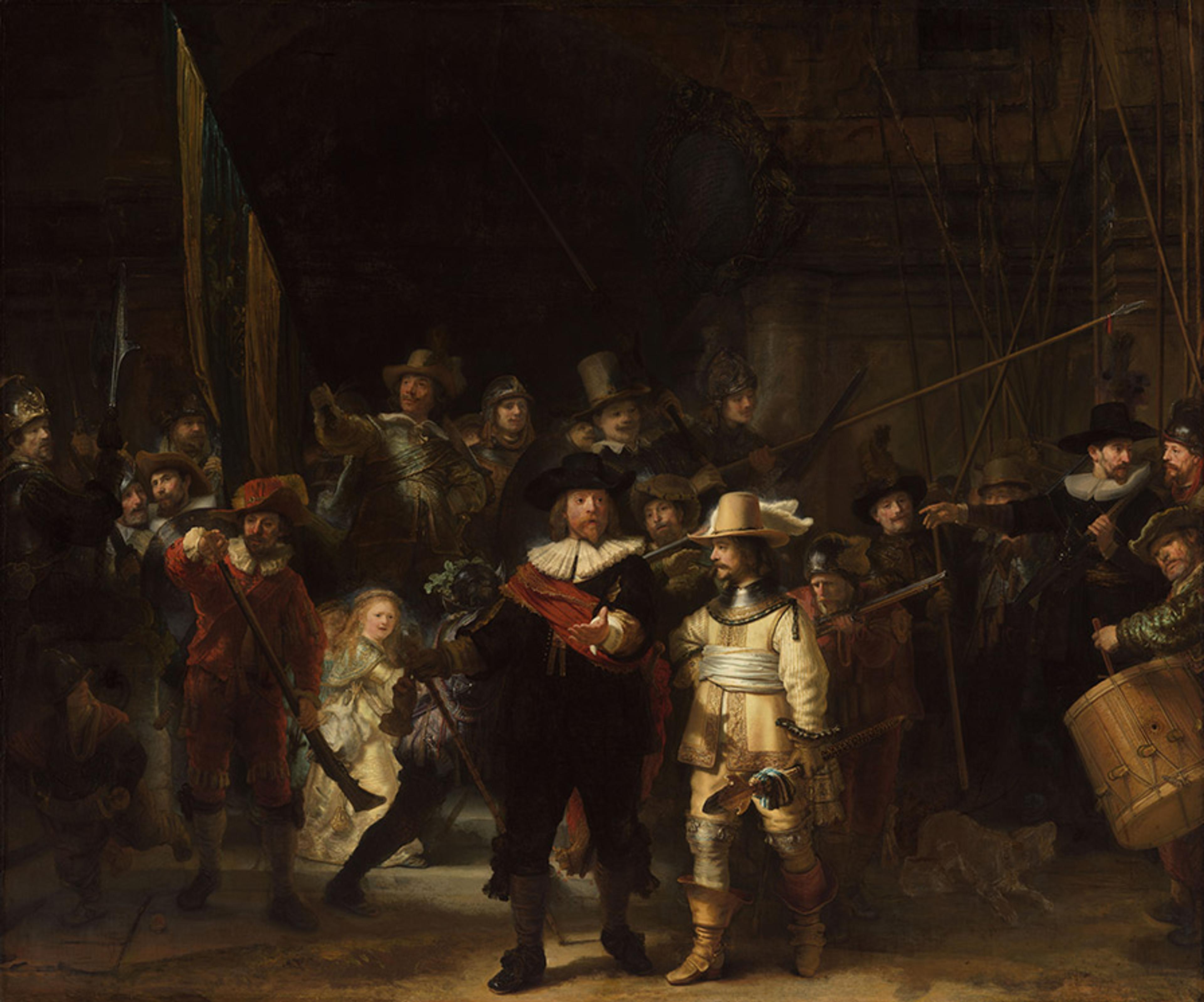
The Night Watch (1642) by Rembrandt van Rijn. Courtesy the Rijksmuseum, Amsterdam
In art, one considers the image, its origins and maker, but the same is true for any image. Who made it; what world did they inhabit; what was their intention? Some information is purely factual, but in art history interpretation works only if it is grounded in fact. The Night Watch was created by Rembrandt, who lived during the 17th century. The scene is filled with well-dressed men carrying weapons. Many of them are pointing; waiting for something perhaps? Or guarding something? Even without knowing that this painting was created for Amsterdam’s civic guard, the patient viewer will notice a good deal.
Understanding a certain amount of history helps. Once, a 16-year-old told me that the patterns on the dress worn by Elizabeth I in the Armada Portrait (1588) foreshadowed the Union Flag. Another thought a Flemish still life by Jan Brueghel the Elder embodied the male gaze. Only after establishing the specifics of a work of art – or a magazine photo or an Instagram post – can interpretation begin. This doesn’t have to be the stuff of textbooks; knowing whether an image was produced 200 years ago or two weeks ago provides a lot of information. Yet, here, subjectivity comes in, since what matters to me is not necessarily what matters to you, and that is a wonderful thing. I may be so focused on the central figure dressed in cream that I fail to notice the drummer peering in at stage left: but, to you, he may be the most important person in the scene, and I want to know why that is.
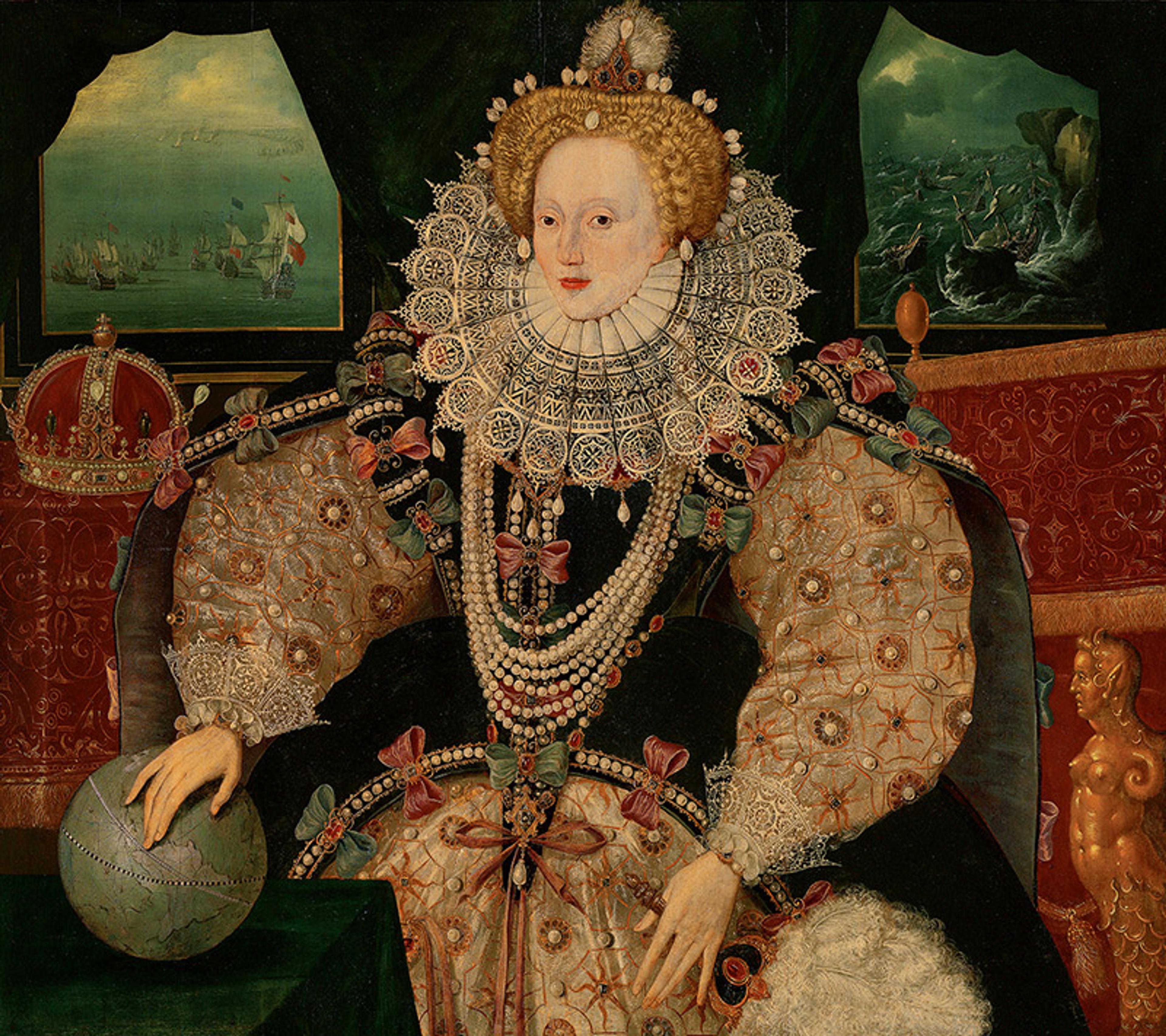
Armada Portrait of Elizabeth I (1588) by an unknown English artist. Courtesy Wikipedia/Royal Museums, Greenwich
Looking intensely at one image, then doing so again and again, is more or less the premise of the writer and critic Brian Dillon’s latest book, Affinities (2023), a text that endeavours to analyse attraction. In a series of short essays, Dillon examines images that he is repeatedly drawn to: what makes them resonate, even after many years have passed? In some ways, this is a basic exercise – one I did in grade school as part of learning how to write, though Dillon makes the case more elegantly. His eye roves widely, taking in photographs by Julia Margaret Cameron or Francesca Woodman, early scientific imagery, memorial plaques, artist studies of movement or emotion, movie scenes, and his mind works speculatively.
A photograph by Helen Levitt features three figures on a New York stoop. The sun is high, and the shadows are engulfing: an elderly woman in a black dress and black knee-high socks blends in with the doorway; another, decapitated by Levitt’s brutal cropping, rests her hand on the head of a small boy. It is 1972, but it could be 1940. Only the dog looks directly at the viewer, the averted gaze being one of Levitt’s recurring motifs. Levitt feared that the streets of New York would soon be devoid of children. ‘The little boy,’ writes Dillon, ‘cannot tell he is almost antique. But the woman in black knows what is passing away, and she’s determined to summon the spirit of city streets still, in the sunshine.’
Dillon, of course, could be wrong. Maybe the woman was hot and hiding from the sun; her weary expression is one I’ve seen countless times on the faces of New Yorkers in high summer. Maybe the little boy has been shouting and the woman is annoyed. Likely, there are many things happening at once: the woman may be exhausted by the city as well as the heat, and saddened by her exhaustion. She may love the little boy. She may never have seen him before. What Dillon sees and what I see are not the same, and his writing embraces the reasons for this difference and its importance.
Affinities makes the case for personal looking. Dillon attends to the vigilante snapshots his aunt took of her neighbour’s garden with the same care he gives to a celebrated William Eggleston print. In a press photograph of charismatic worshippers, Dillon ‘recognise[s] the poise of the woman in white, the way she holds herself together,’ and in the faces of her fellow believers, he seeks out his mother’s. I have similar pictures that I’ve collected and return to: a polaroid of the San Francisco Bay Bridge obscured by a solar flare; Lubaina Himid’s painting Three Architects – Ideas for Development (2019); Ryan McGinley’s photograph Fireworks Hysteric (2007-8), which I first saw illustrating an Italo Calvino story in The New Yorker. They are full of meaning to me, even as I recognise that their association may appear random to anyone else.
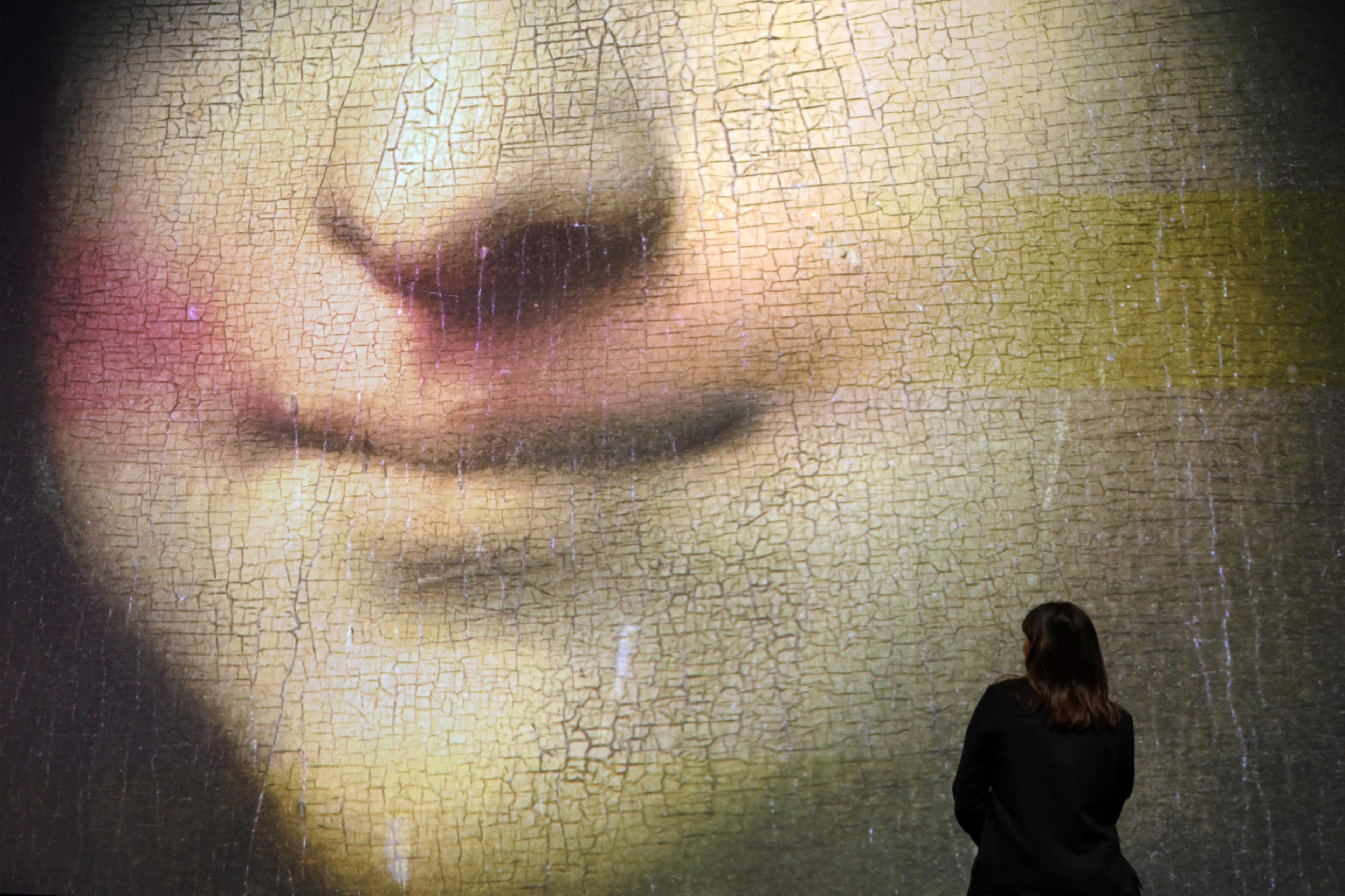
Dillon’s biographical methods may not have much currency in the world of academia, but that is not the realm in which most of us operate. His advocacy of close looking is in many ways anti-academic because it relies on felt knowledge. For Dillon, affinity is an unreasoned impulse; the magnetic draw of an image, the way it imprints on our psyches, the way it holds time still cannot be academically delineated. But the more one surrenders to affinity, the more one can see – and the more one can learn. One can learn how to tease out a narrative, absent of language. Or about nuance, since every sculpture, advertisement or collage is both a subject to talk about, and a prop to talk through. Just as a therapist may ask a child to address a stuffed animal, so art historians use works of art to speak of the world. But art history can be taught without expecting students to become art historians. It can, and should, be taught because people need to understand how to interact with visual material: how to pause the ceaseless flow.
Close looking, above all requires time. It actively opposes the image flow. Looking, truly and extensively, stretches out the moment and demands patience. It means sitting with confusion and ambiguity, and avoiding distraction, which is exactly what the image flow does not want you to do. The endless visual stream is meant to keep you distracted because if you look closely you will see more clearly.
