‘Beauty is in the eye of the beholder,’ wrote Margaret Wolfe Hungerford in her novel Molly Bawn (1878); William Shakespeare made a similar statement in Love’s Labour’s Lost (‘Beauty is bought by judgment of the eye’); and such sentiments have been attributed even to Plato.
Yet, for centuries, people have been trying to find objective ways to characterise this ineffable quality of beauty (more broadly, of aesthetics). Are certain shapes or forms more attractive than others? Can visual appeal be codified, perhaps even predicted, in terms of adherence to some universal norms? Is there a formula for beauty, a rubric, a way to measure it?
These questions have taken on more import in our digital age, with its demands to rate everything on a numerical scale. The quest for a mathematical way to assess beauty has arisen in such diverse contexts as AI websites that spit out attractiveness scores based on uploaded photographs of your face, and medical studies aimed at providing guidelines for plastic surgery.
Some of the earliest attempts to frame beauty and aesthetics in mathematical terms arose during the Renaissance. For instance, this is when Andrea Palladio, inspired by ideas propounded in the 1st century BCE by Vitruvius, came up with detailed quantitative recommendations for architecture that survive to this day. One of the most enduring tropes that gained popularity during this time was that of the Golden Ratio, a number roughly equal to 1.618 that had been known by the ancient Greeks, and discussed in Euclid’s monumental 300 BCE work, The Elements. Luca Pacioli, an Italian mathematician who studied both art and theology, set this popularisation into motion with the publication of his three-volume book Divina proportione (1509), or the ‘divine proportion’, his appellation for the Golden Ratio.
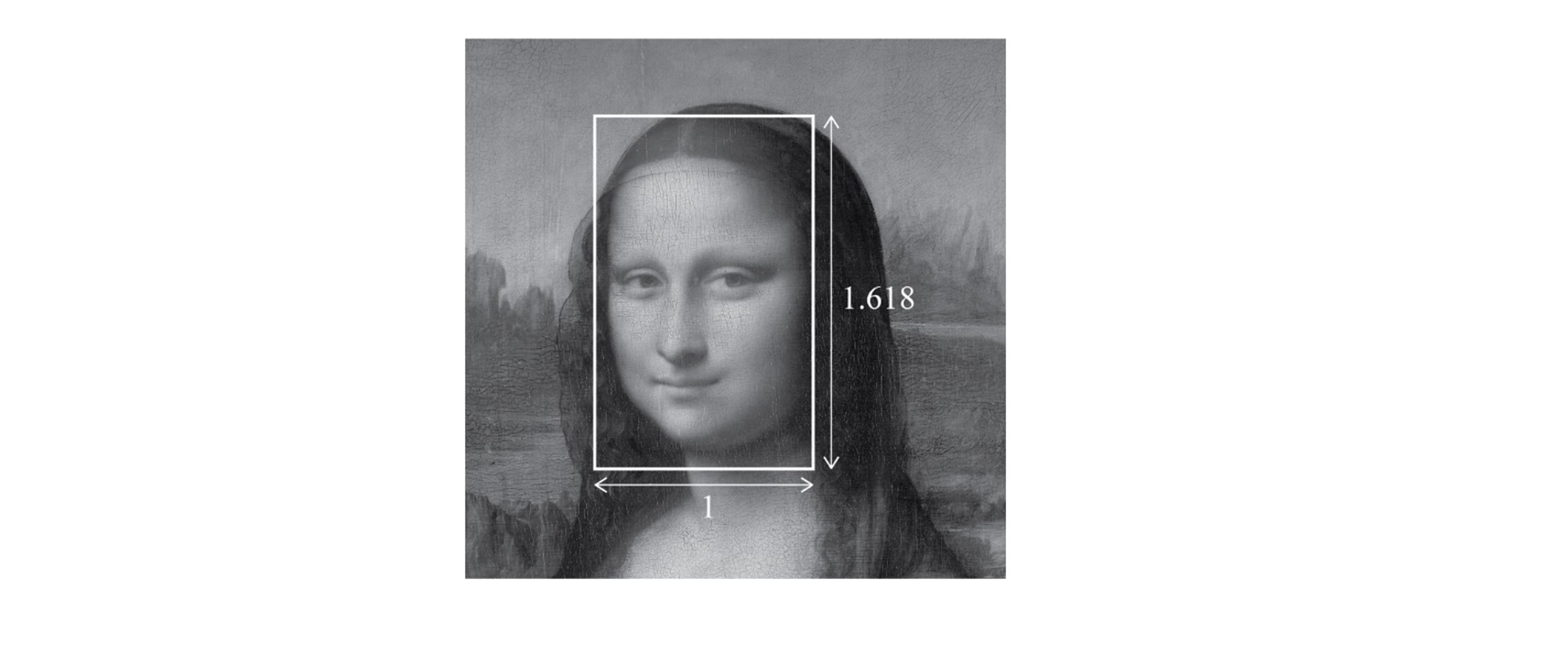
Pacioli was effusive in his praise of the ratio, using language like ‘essential’, ‘wonderful’ and ‘supreme’ to describe its effects, and touting in particular the harmony of the Golden Rectangle, formed by creating a rectangle with sides in the proportion 1:1.618. It probably didn’t hurt his message that his friend, the great Leonardo da Vinci, who also learned mathematics from Pacioli, contributed 60 drawings to his book.
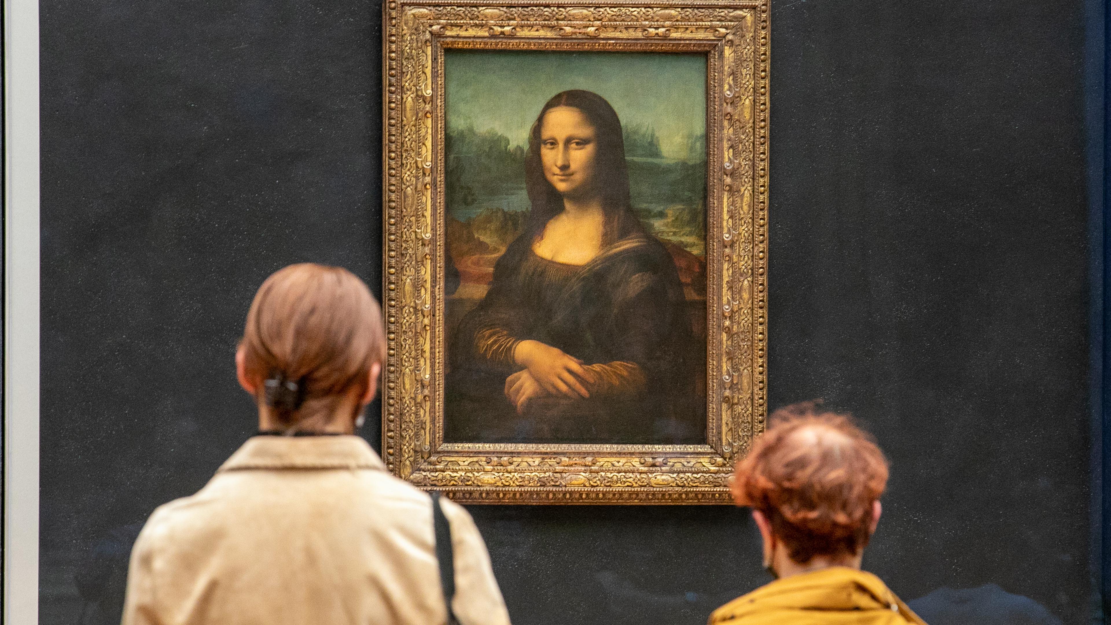
Whether da Vinci was enamoured enough by the Golden Ratio to incorporate it in his own work, as some scholars have tried to establish, is a matter of debate. What’s undeniable is that the ratio has acquired a mystical quality, not unlike what Pacioli promoted, as a proportion especially pleasing to the human eye. Research (much of it inconclusive) has been conducted to test whether the Golden Rectangle is the rectangular shape most favoured by subjects, and whether faces deemed attractive have proportions closer to the Golden Ratio. The Mona Lisa is often seen on the internet peering out of a Golden Rectangle, to underscore the popular notion that her beauty derives from the ratio.
There is another mathematical quality advanced by a host of historical figures (including Plato, Aristotle and Vitruvius) as a prime contributor to beauty: symmetry. As far as human faces (and bodies) go, the reason for finding symmetry attractive can be explained based on evolutionary reasons – symmetry indicates health and, therefore, suitability to be a reproductive mate; there are no defective facial parts or missing limbs. This biological criterion pertains only to bilateral symmetry: ie, one where the left and right sides are mirror images of each other. But designs can often incorporate additional symmetry for aesthetic reasons – for instance, by making them mirror images across multiple axes, instead of just one. Such symmetry is found, for example, in Persian and Mughal Charbagh gardens, Islamic art, the artist M C Escher’s patterns and, more ordinarily, in polygonal shapes. A rectangle is mirror-symmetric across two axes, a square across four. A regular octagon, as we shall see, has eight axes of symmetry. The French mathematician Évariste Galois, who put all the theorems in his head to paper the night before dying in a gun duel in 1832, is often credited as the originator of group theory, a branch of mathematics that gives a way to precisely characterise an object’s symmetry.
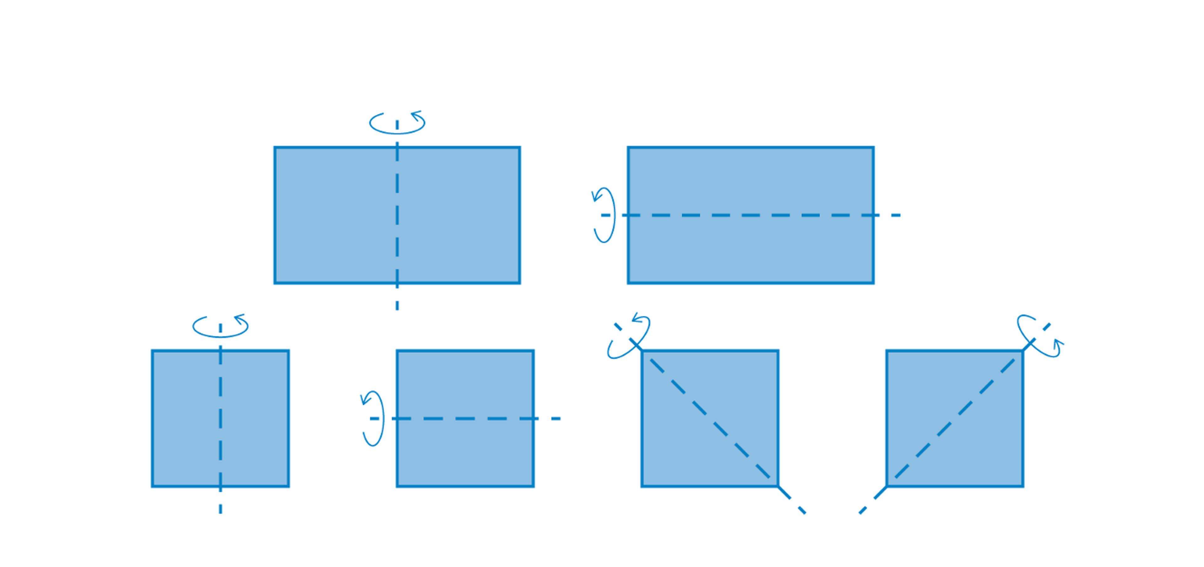
Does increasing an object’s symmetry enhance its aesthetic appeal? A formal link between the two was proposed in 1933 by the Harvard mathematician George David Birkhoff, who developed a mathematical formula in which the ‘aesthetic measure’ M of an object equalled its ‘order’ O divided by its ‘complexity’ C. Defining such terms, much less giving them numerical values, is fraught with difficulty, as Birkhoff himself confessed. In the years since, there have been several contradictory studies examining Birkhoff’s thesis through experiments, or proposing alternatives to his speculative formula (eg, M = O × C instead of M = O ÷ C). However, two broad points of agreement emerge from all this conflicting work: first, that the aesthetic measure increases when the order increases and, second, that this order is greater for objects with more symmetry. In other words, making an object more symmetric should make it more beautiful.
We’re going to test this with the Mona Lisa, who, as many have asserted, conforms well to the Golden Ratio criterion for beauty. In terms of the alternative criterion based on symmetry, though, she’s a bit of a dud, failing even the bilateral symmetry test. Let’s therefore give her a mathematical makeover by making her more symmetric, and see whether she becomes more beautiful in the process.
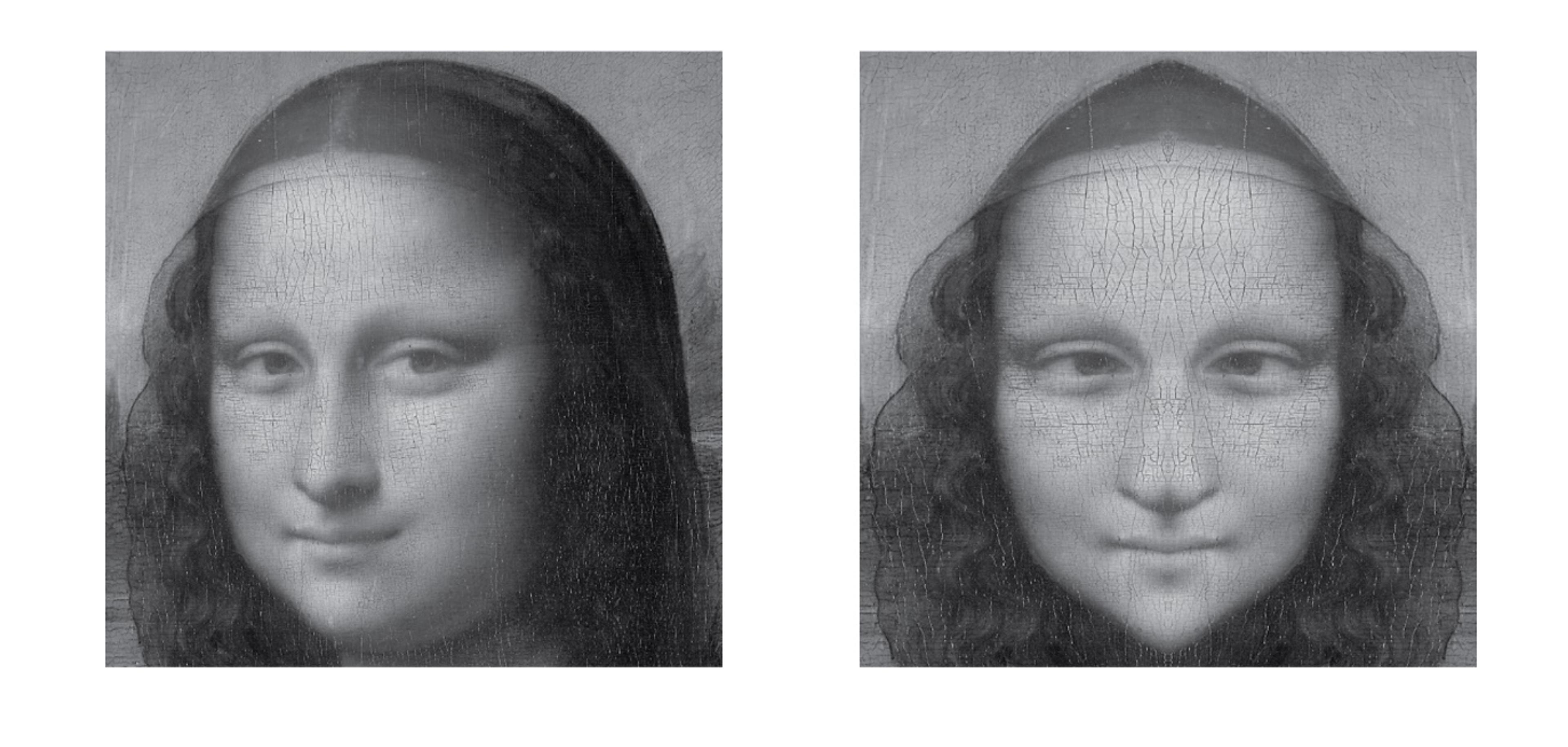
Start by duplicating the left half of the face on the right (you’ll need to stretch it a bit to restore it to the original size). Unfortunately, this doesn’t work too well – it makes her look a bit zonked, with a pointy skull and a Gérard Depardieu nose. Let’s persevere, however – by cutting and pasting and resizing further to make her even more symmetric. Like this:
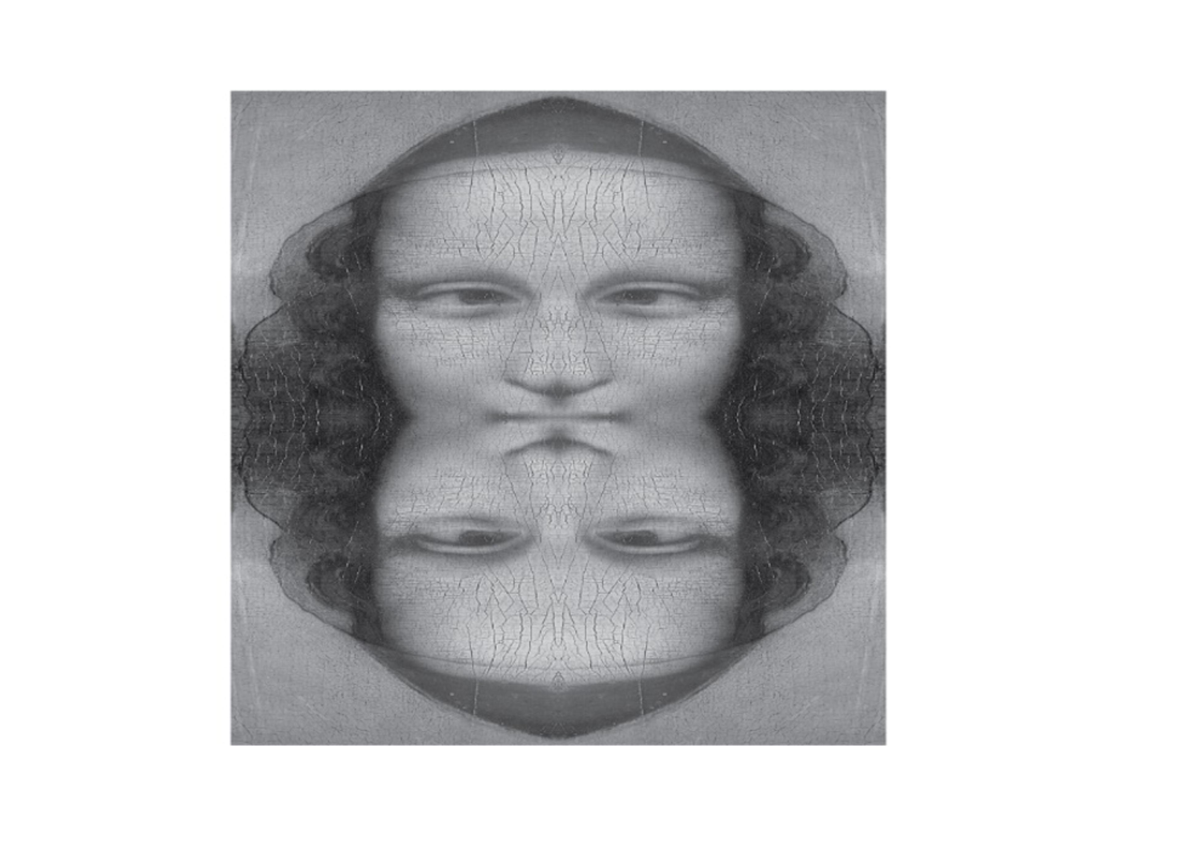
This is uglier, not more beautiful, you might point out. But you can hear mathematicians rejoicing, because Mona is now symmetric across both the horizontal and vertical axes – in the same way a rectangle is! Let’s therefore continue – cut Mona into quarters, and paste together four copies of the top wedge to make a whole:
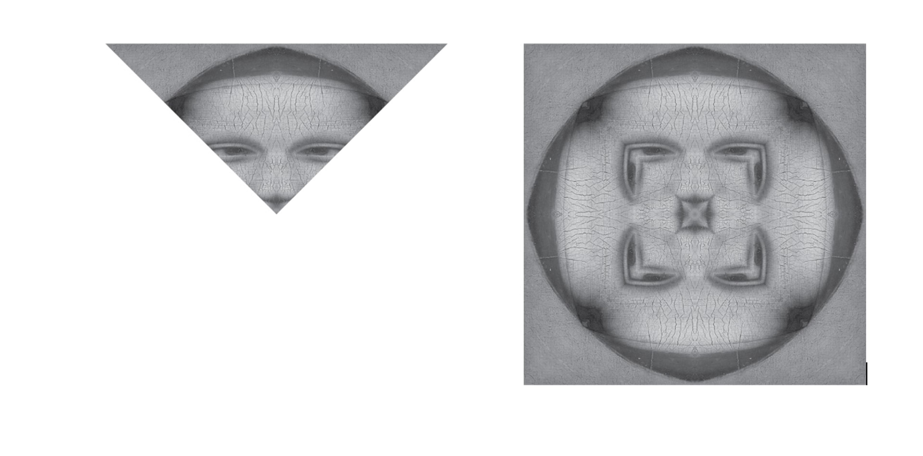
OK, I admit she’s started looking a little bloated, like a baleful soccer ball. But notice she’s now symmetric across the diagonals as well: ie, she’s risen to the same level, symmetry-wise, as a square! And if you take that same wedge, shrink it to a thinner triangle, and stick eight copies together, you’ll get an octagon. (See if you can spot the eight axes of symmetry.) Shrink it even more, so that 12 copies can fit together, and you get a dodecagon.
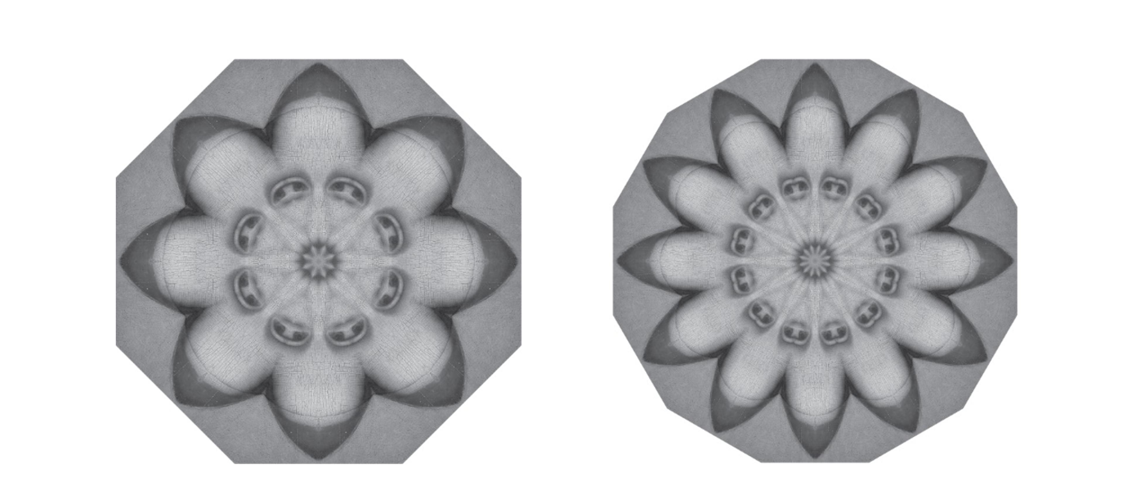
Something’s changing, do you notice? It’s symmetry, working its magic. Mona’s getting beautiful again, in a flowery, tableclothy sort of way. So reduce each wedge into the thinnest sliver you can manage, and then paste together as many as will fit.
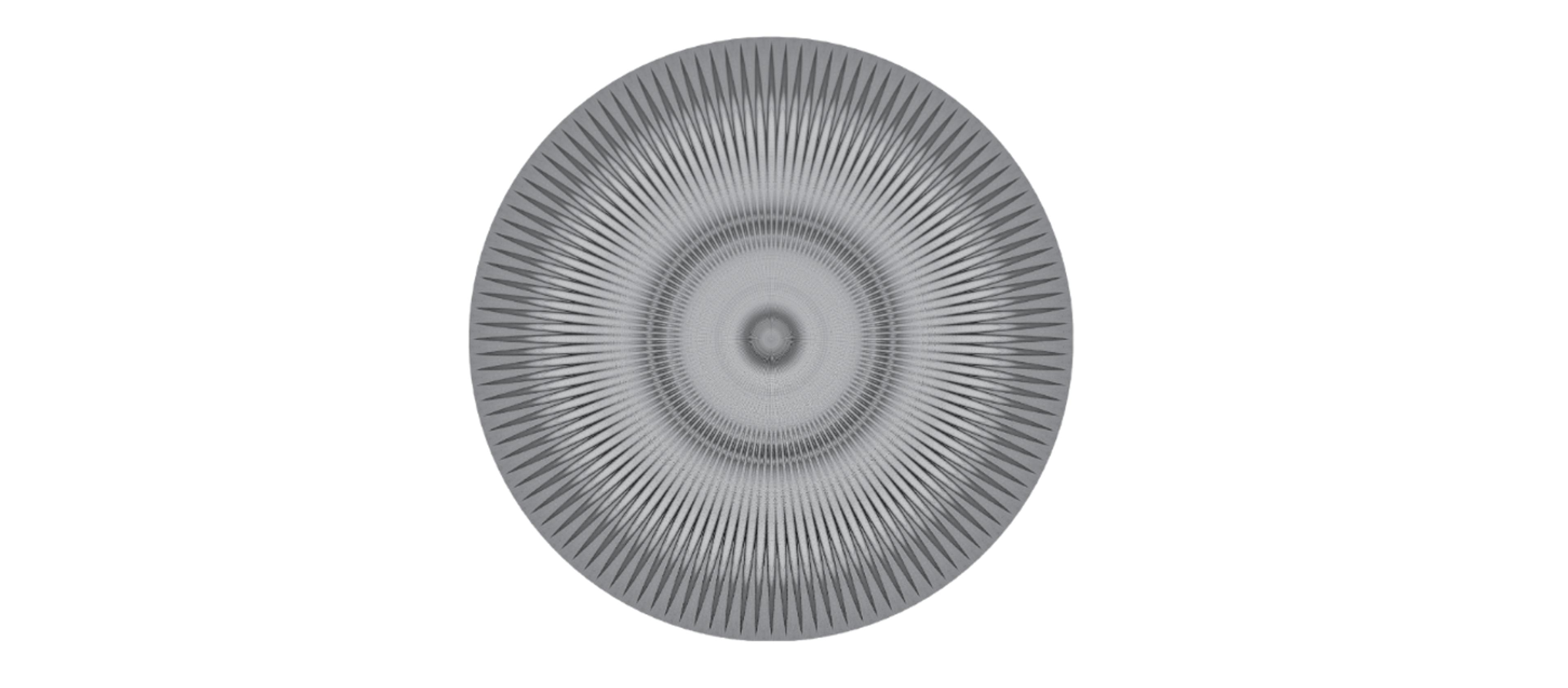
Now you can tell what will happen in the limit. In her final transformation, Mona will be reincarnated as a circle – the most symmetric figure there is. Her essence will still pervade the disc, but in a blended, abstracted sort of way.
What’s emerged is an entirely new aesthetic – one that’s very geometrical, very orderly, and very different from the Golden Rectangle attractiveness of the original Mona Lisa. Maybe this is a distillation of what Plato and Galois and Birkhoff were trying to capture.
This points to a difficulty in the search for a universal criterion for beauty that goes beyond just differing personal taste. The two heuristics we’ve explored – the Golden Ratio and symmetry – may both give rise to beauty that is universally appreciated. However, the aesthetics that result are intrinsically in conflict with each other.
